 |  |  |  |
|---|
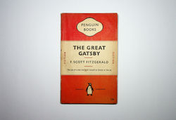
The great Gatsby / F. Scott Fitzgerald. Harmondsworth: Penguin, 1950
"One of Tschichold's first design tasks was to refine the Penguin series covers. The elegant golden section proportions, 4 3/8" x 7 1/8" (111 mm x 181 mm), color-coding by genre, san serif typographic covers, and bird logo were based on the German Albatross Books series, which set the standard for early paperback publishing by using design as an effective form of branding. Although Tschichold was prevented by his publisher to completely redesign the Penguin series due to brand loyalty, he did what he could to modify the existing 'Penguin look' -the distinguishing orange horizontal stripes, developed by the imprint's first production editor, Edward Young (1913-2003). Tschichold had inherited a cover design whose elements, Penguin book label, typography, and logo, were all the incorrect sizes and did not correspond proportionally to one other. In particular was the erroneous serif typeface for the label and the flawed sans serif typeface for the title and author, which was to tightly letterspaced, appearing condensed and difficult to read. In 1948, Tschichold's first revision included the introduction of different weights of monotype Gill Sans for hierarchy and emphasis, meticulous letter and word spacing for both the title and author's name, and a warmer tone of the original orange color (...) For the second revision, Tschichold redesigned the Penguin logo at the bottom center of the fron jacket. He also reduced the point size of the typography and introduced a four-point line between the title and author's name. What he did retain was Penguin's characteristic color-coding by genre -orange for fiction, green for crime, blue for biography, burgundy for travel, yellow for miscellaneous, and gray for current affairs- and avoidance of pictorial covers. Tschichold final revision of the Penguin cover in 1949 was to modify the Penguin Book trademark. He improved the letter spacing and reduced the overall size for improved proportions. He decreased the line between the title and the author's name to two points and also introduced two hairline border rules above and below the title and author's name. These final revisions firmly established a standarized format, which unified the Penguin series".
Richard B. Doubleday. Jan Tschichold designer: the Penguin years. New Castle: Oak Knoll; Aldershot: Lund Humphries, 2006 (p. 45-47)
