 |  |  |  |  |
|---|---|---|---|---|
 |  |
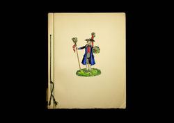
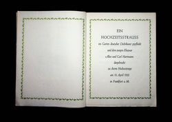
Ein Hochzeitsstrauss im Garten deutscher Dichtkunst. Frankfurt: Bauersche Gießerei, 1933
“She freelanced, with commissions for designing books for various publishers, but her most important commission was the invitation to design a typeface for the Bauersche Giesserei of Frankfurt am Main. This was in 1927 or 1928. It was not so usual for a woman to design a type, the introduction may well have been via her teacher, Weiss, who himself designed types for Bauer. Georg Hartmann, the firm's director, built up the international reputation of the Bauer Typefoundry by his shrewd selection of talented designers, among them Paul Renner, Imre Reiner and Berthold Wolpe (...)
The 'Elisabeth' types, Antiqua (Roman) and Cursiv (Italic) were long in the making. Reading the first in a series of letters kept by Elizabeth Friedlander, dated September 14th 1932, it is obvious that she and Hartmann have known one another for some time. After friendly preliminaries, he comes to the point, saying that "the type would long since have been brought out were it not for the catastrophic economic state of our trade which means we cannot start anything new...Even so, your type needs only a few months to be finished."
But the next letter is dated April 26th 1933 and the Nazis had been in power for three months. Hartmann begins soothingly but it was not an easy letter for him to write. "Your lovely Italic has now been cast in one size and has been used by a private press...for an invitation. I'll send you one, you'll be pleased with it" and goes on to say "You will be less pleased with what I have to ask you; that is, that in view of current conditions the type should not appear in the name of Friedländer-Antiqua but as Elisabeth-Antiqua. It is painful for me to have to ask you this" (...) In Germany, Friedländer was seen as beeing a distinctively Jewish name.".”
Pauline Paucker. New borders: the working life of Elizabeth Friedlander. Oldham: Incline Press, 1998 (p. 7-8)
