 |  |  |  |  |
|---|---|---|---|---|
 |
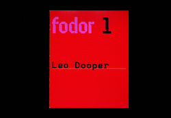
Wim Crouwel. Fodor, nº 1. Amsterdam: Museum Fodor, 1972
“One of Crouwel's most interesting alphabets is the one he created for the small Fodor Museum. For the cover of the museum's bulletin he conceived a basic design in two colours which was to be overprinted in black for each issue. To save money on typesetting, the black text was 'set' on an electric typewriter which Crouwel had at his disposal at the Stedelijk (it came with a typist). Crouwel liked the contemporary look of the square typeface, and also the idea that the monospaced characters formed both horizontal and vertical lines. This was made visible by a regular pattern of pink dots on the orange background. The characters f o d o r and the numerals were created on top of this grid. What could have been a straightforward modernist construction became quite a remarkable typeface through a simple but brilliant intervention. By breaking through the outlines and counters of each character with rounded notches, Crowel at once created a computer-style, 'futuristic' feel and a forward movement which refers to formal writing and the traditional typefaces derived from it. A complete corporate alphabet was developed from the principles used in the fodor logotype: an admirable hybrid indeed.”
Jan Middendorp. “Wim Crouwel and Dutch calvinism.” In Dutch type. Rotterdam: 010, 2004 (p. 121)
