
 |  |  |  |  |
|---|
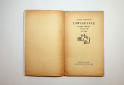
Edward Lear / Angus Davidson. Harmondsworth: Penguin, 1950
“During his time at the company (1947-9) he re-educated all its printers about standards and consistency in typesetting. These were famously brought together as the Penguin Composition Rules, originally a four-page leaflet containing concise and precise instructions on typographic style. Among his most influential instructions was 'Capitals must be letterspaced'. The Penguin logo had undergone several changes in twelve years of use, and Tschichold redrew Edward Young's 1939 version to create a definitive model. It lasted until 2003. The standard and distinctive tripartite cover was given a facelift. Three small changes -a more consistent use of Gill Sans typeface with slight letterspacing, a thin rule between title and author, and a consistent use of space- made for a far more distinguished cover. Not all of these changes appeared immediately, and Tschichold had to spend much time setting out clear written instructions for these and all other aspects of his reforms”.
Phil Baines. Penguin by design: a cover story, 1935-2005. London: Penguin Books, 2005 (p. 51)