
 |  |  |  |  |
|---|---|---|---|---|
 |  |  |  |  |
 |
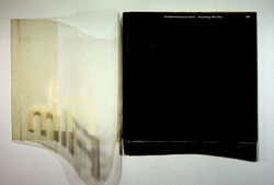
Josef Müller-Brockmann. Der Film. Zürich: Kunstgewerbemuseum, 1960
“For this exhibition catalogue about "The Film" the jacket's material is not glassine but a very fragile film-like plastic. The akzidenz-grotesk title is printed in white on the "film" – visible on the black cover like the light in the dark cinema. The impressum credits Jörg Hamburger (*1935) and Serge Stauffer (1929-1989) for the design. The exhibition poster is very similar (...) Interestingly, the poster is signed "j. müller brockmann" so i guess the brochure cover can be attributed to Josef Müller-Brockmann (1914-1996). Müller-Brockmann, Hamburger, and Stauffer were Kunstgewerbeschule teachers at the time. The brochure cover (...) is even more striking than the poster: in the latter lacks the transparent look of the superimposed letters. The typography is Swiss style: multi-column, grid-based layout.”
Felix Wiedler. “Hans Fischli, Willy Rotzler: Der Film”. Book (design) stories. From new typography to Swiss style: modernist book design in Germany and Switzerland 1925–1965 (and beyond), 2007 htps://wiedler.ch/felix/books/story/235
“The title projects clearly at great distances against the field of black, and the overlapping of Film in front of der is a typographic equivalent to the cinematic techniques of overlapping images and dissolving from one image to another. The graphic power of this poster’s elemental simplicity successfully combines effective communication, expression of the content, and visual harmony.”
Philip B. Meggs, Alston W. Purvis. Meggs' History of Graphic Design. 6th ed. Hoboken: John Wiley, 2016 (p. 407)