 |  |  |  |  |
|---|---|---|---|---|
 |  |  |  |  |
 |  |  |  |  |
 |  |  |  |  |
 |  |  |  |  |
 |  |  |  |  |
 |  |  |  |  |
 |  |  |  |  |
 |  |  |  |  |
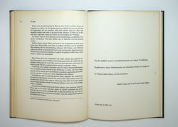
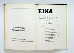
Typographische Gestaltung / Jan Tschichold. Basel: Benno Schwabe, 1935
“His book Typographische Gestaltung of 1935 shows a peak of his delicacy in choice and placing of visual elements. The surprising yuxtaposition of typefaces on the title page of that book -the script typeface of the author’s name is used nowhere else in the book- shows the leap beyond simple ‘designing by constraints’. So too does the placing of the author’s name in a visually satisfying spot, above the title line. Sufficient anchoring of the ensemble is achieved in the second and third lines of the piece, ranged respectively from the right and the left of the page area. Typographische Gestaltung is wonderfully durable and subtle as an object. The thickness of its boards, the colour and texture of their cloth covering, the use of the label on the spine, the rounding of the spine. It is a primer or work-book, but one with life to it. Yet the book was made in 1935, in an Europe running fast towards calamity. Tschichold’s serenity -perched now in relatively safe Switzerland- had that context”.
Robin Kinross. “Designer and dogmatist”. Idea, nº 321, 2007 (p. 34)
